Step Inside My Kitchen

Step Inside My Kitchen

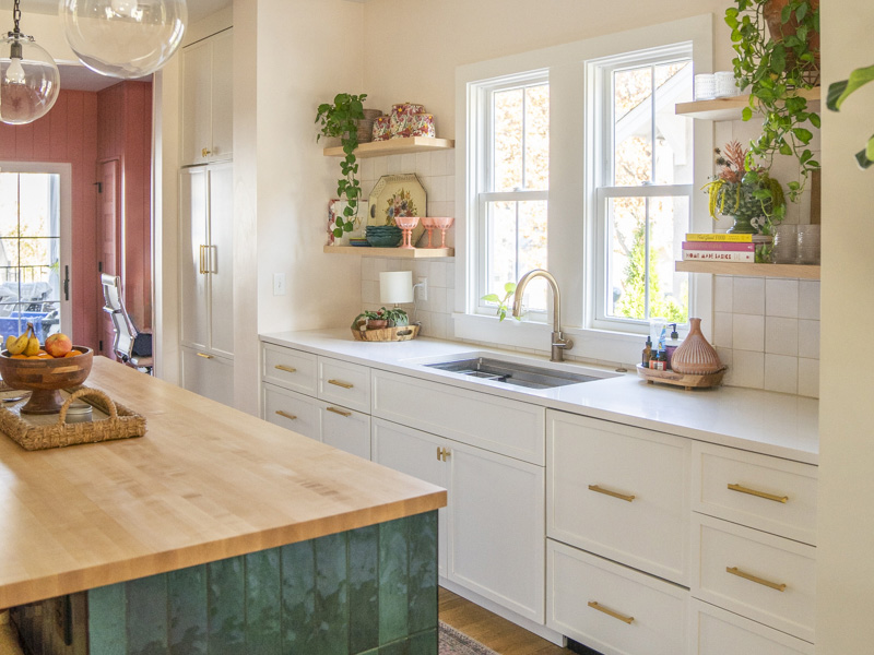
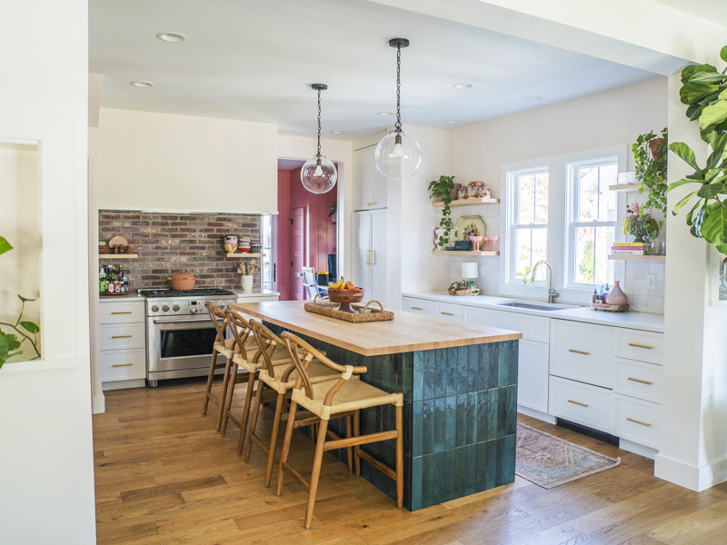
The hub of our house and the first thing you see when you open the front door.  If you’re someone who appreciates design that’s both eclectic and intentional, then you’re in the right place!

In this blog post, I’m excited to take you on a tour of my kitchen, sharing the design elements that make it uniquely ours. From the brick backsplash to the butcher block island top, and even the pink door to the basement, I’ll walk you through the choices that bring this space to life. I hope you find inspiration for your own kitchen, or maybe even for any project that needs that perfect touch of character.

I would like to thank my husband, Troy, for allowing me to do whatever the hell I want in the design of our home. He knows how important design and creating a home is to me. xoxo

Shop everything from my paint colors, to where I got my chairs, and appliances HERE.

1. The Pink Door to the Basement: 

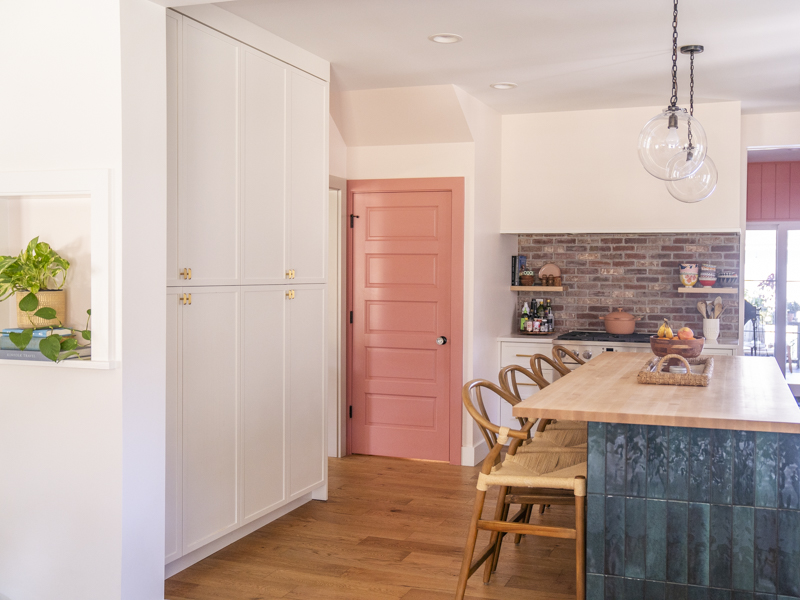
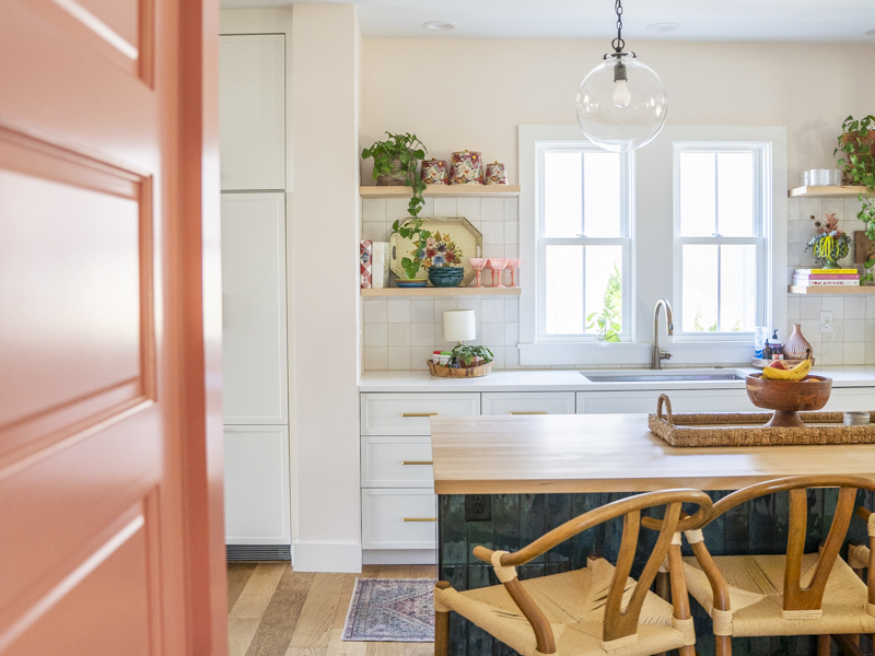
Now, let’s talk about that pink door (Resounding Rose by Sherwin Williams). It’s a little quirky and adds a pop of personality. It’s one of my favorite elements of the kitchen. The door leads to the basement, so it’s not a central focal point of the room. It’s that unexpected splash of color that brings a playful energy to the kitchen.

I love this color pink. It’s not a pastel or soft pink, but more of a bold, rosy hue that feels vibrant without being overwhelming. I love how the pink door contrasts against the more neutral colors of the space. The door serves as a surprising focal point that gives the kitchen personality without feeling out of place.

Picking the right color is SO important. I am grateful to have worked beside Lisa Knight in the design (of our entire home). I will do a blog post soon about my experience building a house. I will say, we had the best people on our team.

A bright color or unexpected design element can elevate the entire space. I also painted my office (which you can see) pink too.
2. The Brick Backsplash: 

One of the first things you’ll notice when you enter my kitchen is the exposed brick backsplash. It’s rustic, it’s bold, and it sets the tone for the entire space. I wanted a material that would bring warmth and texture to the kitchen without feeling too overwhelming. Brick reminds me of growing up. I have always loved a brick patio and brick fireplaces, and was excited to put brick into my mantel, office floor and backsplash.

The natural variation in the brick’s color—ranging from soft reds to light browns—gives the space depth and dimension. I love the contrast between the smooth, polished countertops and the rough, natural finish of the brick. This blend of opposites creates a balanced aesthetic.

3. Tile on the Island: 

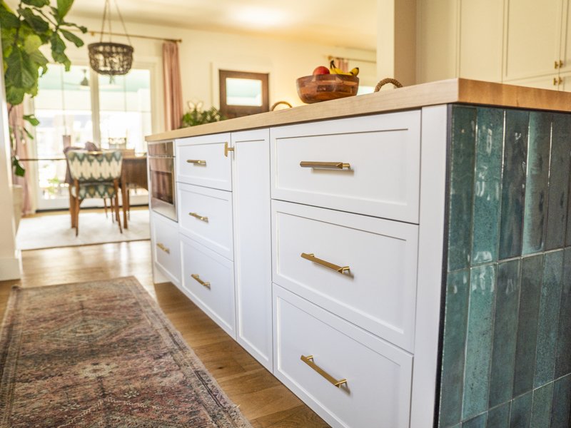
Speaking of texture, let’s talk about the island. While the rest of the kitchen features wood and stone elements, We wanted the island to stand out as its own piece.

The tiles on the island add visual interest, breaking up the neutral tones. Plus, they’re durable and easy to clean.
4. Butcher Block Island Top:

The butcher block island top is one of the most practical, yet beautiful, choices I’ve made for my kitchen. Not only does it provide a durable surface for chopping, prepping, and even rolling dough, but it also adds a layer of warmth that contrasts with the cooler materials around it.


  1. Pot
  2. Gold pull
  3. Lotus Petal Paint Color
  4. Teal Tile
  5. Range
  6. Pendant Light
  7. Counter height Chairs
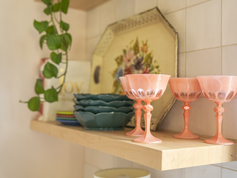
  8. Teal plates
  9. SHOP MORE OF MY KITCHEN
2048 2048 Heidi Creative Co.